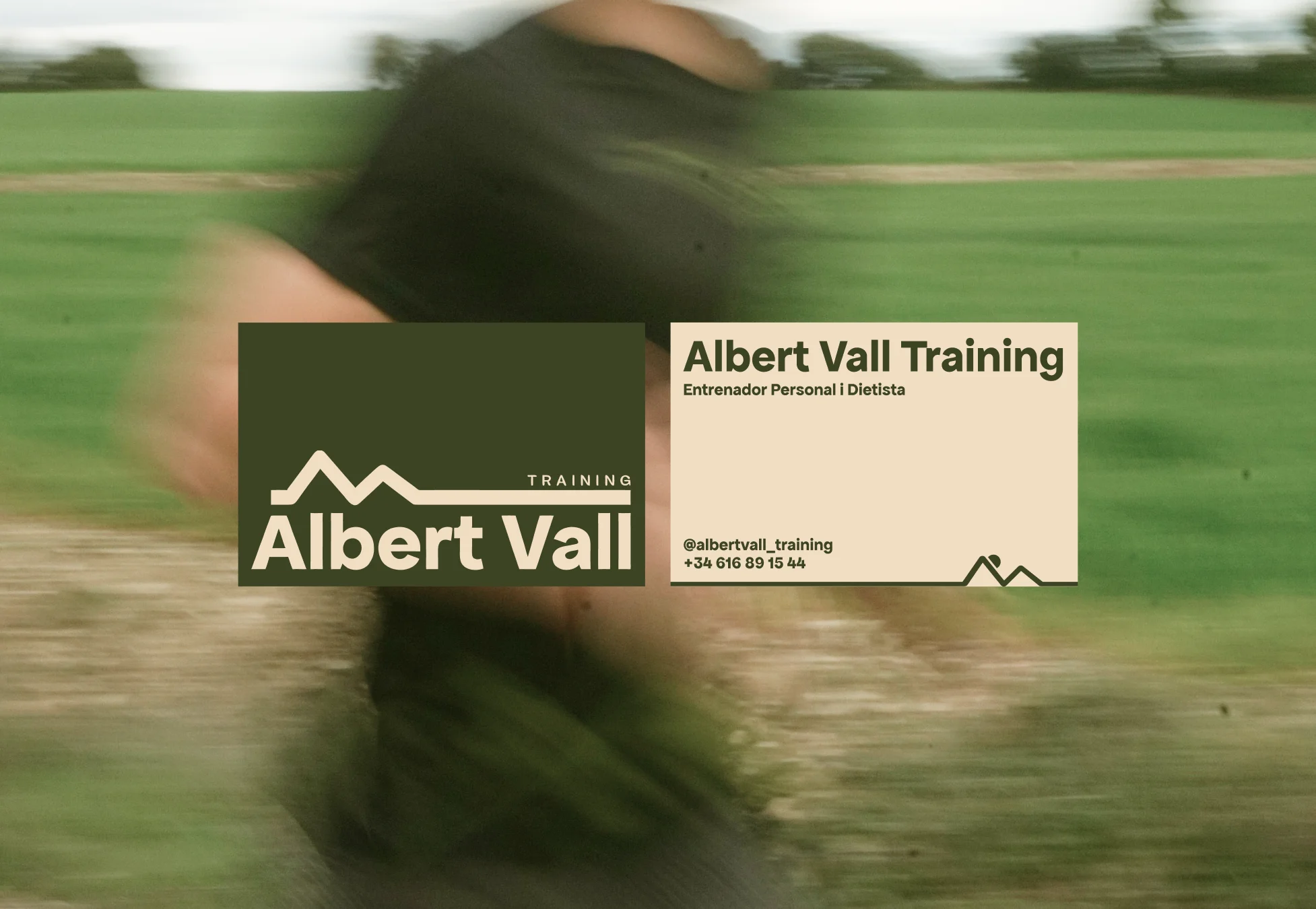
Albert Vall Training
Albert Vall is a personal trainer and dietitian whose work lives in the mountains, on trails, long climbs and the open roads of outdoor sport. This brand was built to match that commitment: a visual language rooted in nature, shaped by movement, and designed to grow alongside him.
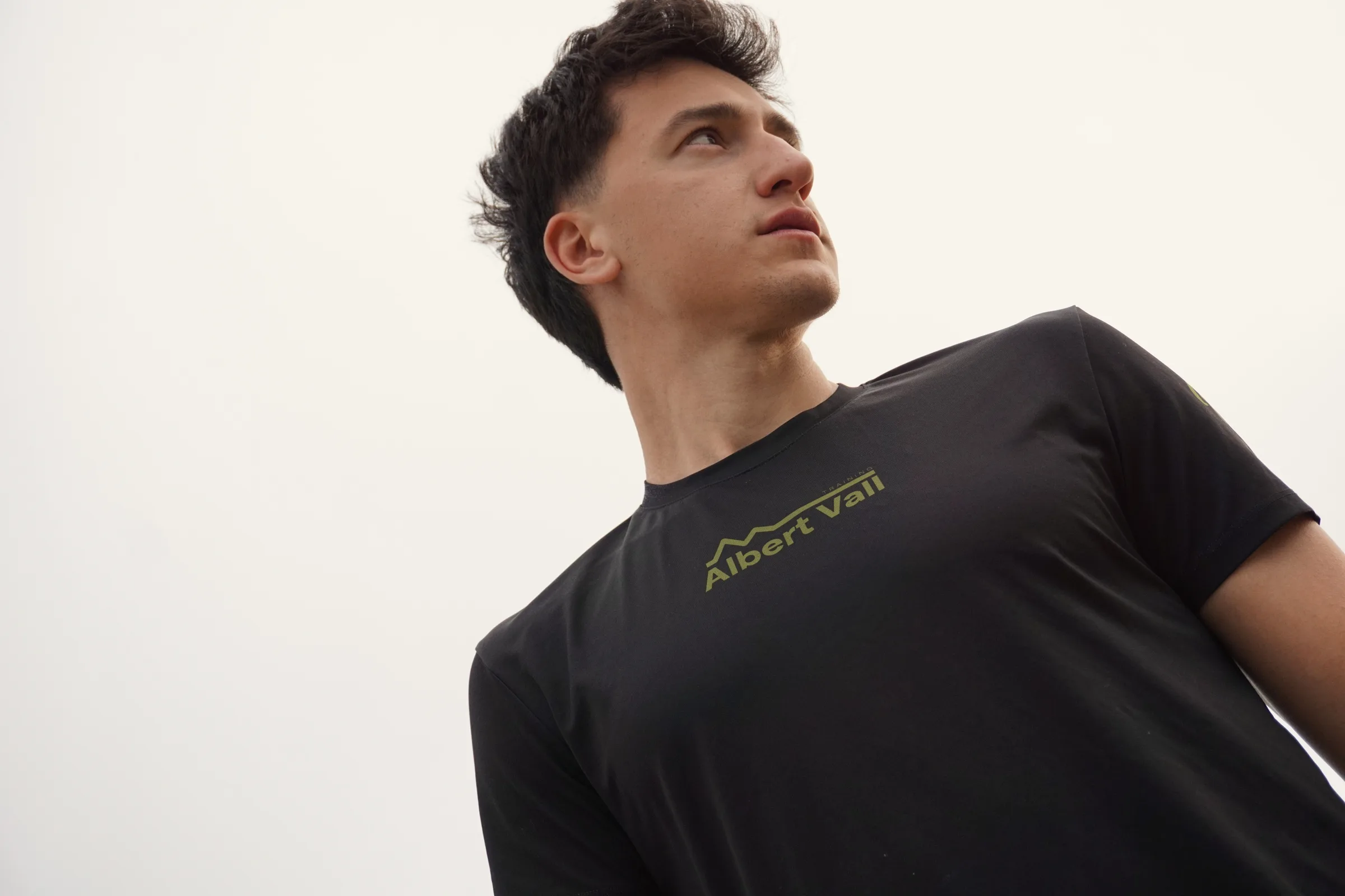
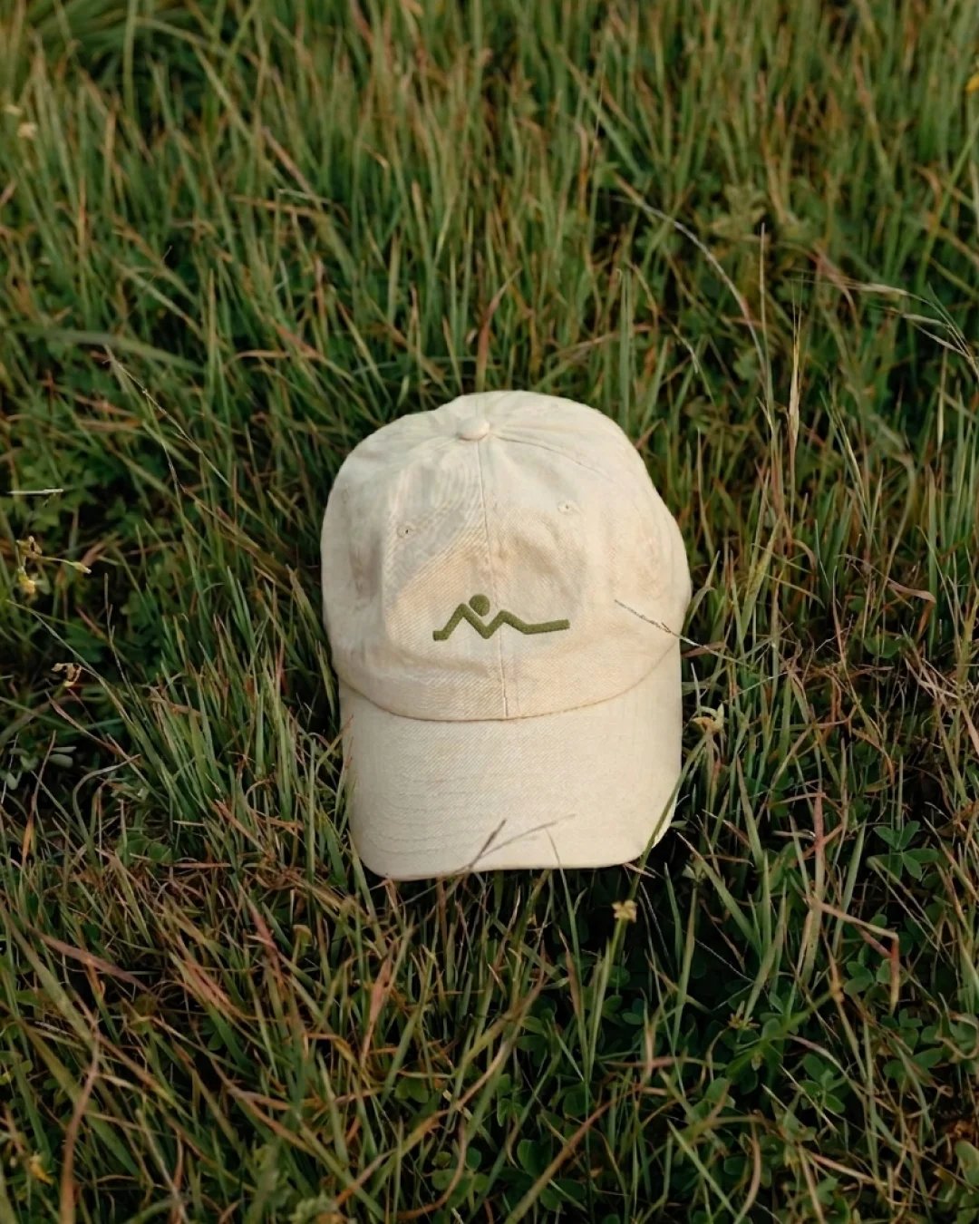
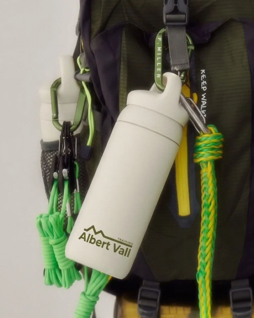
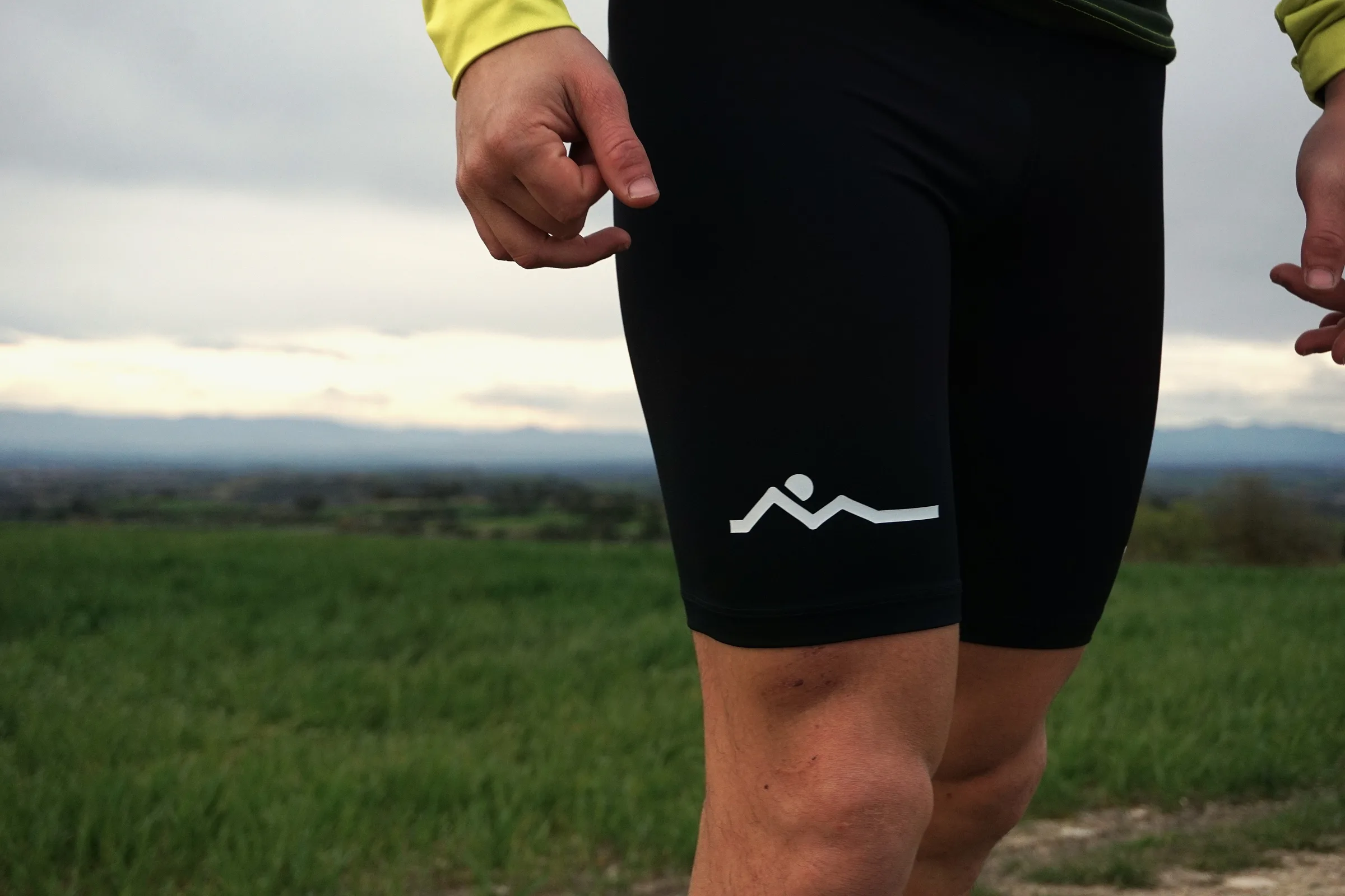
At the core of the identity is a single mark, a distilled form that holds the mountain, the horizon line and a runner's silhouette in one gesture. It came from trying to capture honestly what Albert does: guiding people through terrain that demands something of them. The icon was drawn to hold its weight at any scale, from an embossed cap to a tiny icon on a phone screen, without losing its meaning.
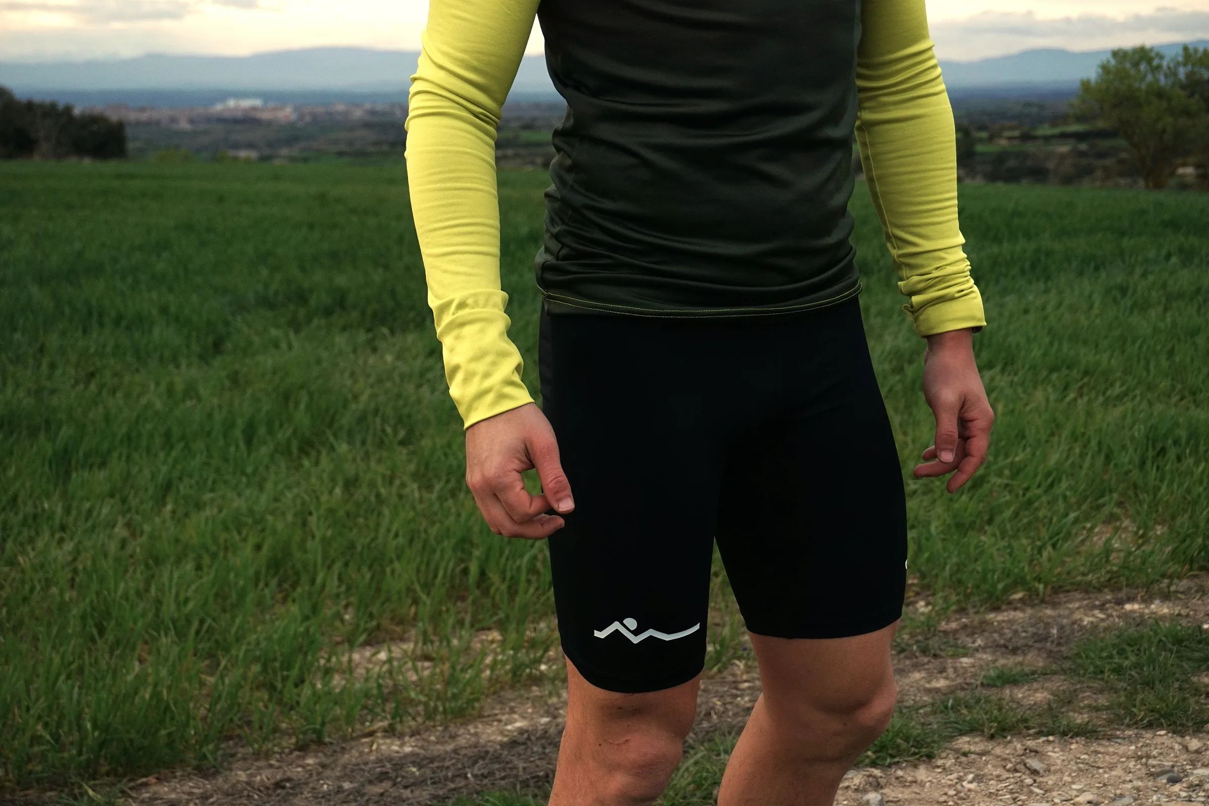
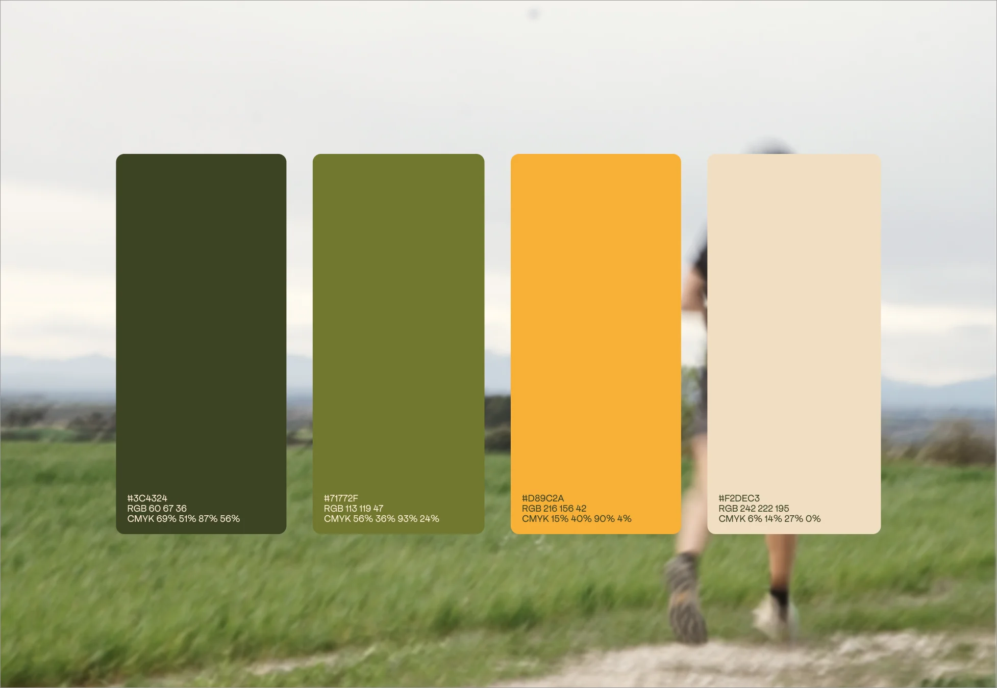
The palette is built from the places where Albert works. Forest green carries the steadiness of the mountain at dusk. Olive extends that connection into the undergrowth, into growth. Amber holds the warmth of exertion, the gold at the end of a long climb. And an off-white cream keeps everything legible and composed, so the system can breathe across light and dark contexts without ever feeling generic.
Apfel Grotesk was chosen for its character, not its novelty. A geometric sans-serif with clean strokes and quiet confidence, precise without feeling cold, structured without feeling stiff. It suits a practice that is both rigorous and human. Whether in a training guide, a social post or a printed card, the typeface holds the same composure throughout.
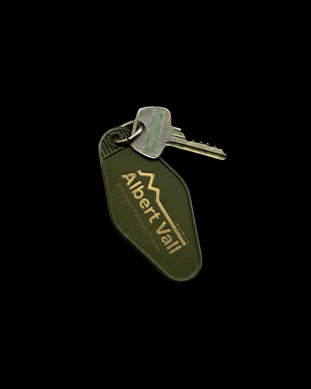
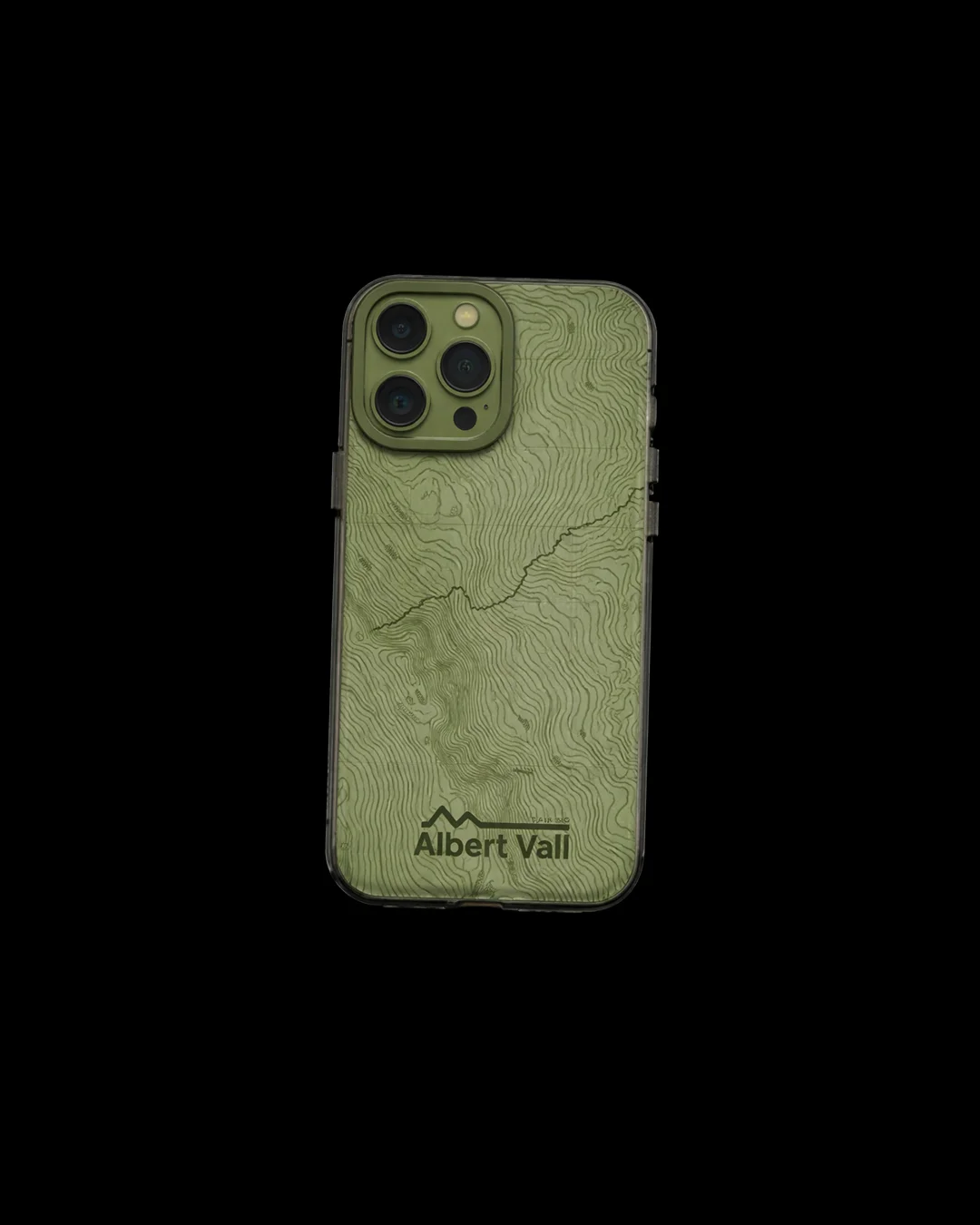
Everything in this identity was designed to survive real use. The mark was drawn to hold its form whether stitched into a jersey, pressed onto a bottle or printed small on a label. The palette is dark enough to carry weight in emboss and light enough to stay legible across digital screens. A brand built for the outdoors has to perform there too, not just look right on a mood board.